 |
| Image courtesy of mwomercs.com |
I have just 3 words to say about the Battlemaster... OH MY GOD!!! Seriously, OH MY GOD!!! I LOVE EEEET!!! I literally stayed up till 3am just so I could see the artwork. I wasn't disappointment. For me; the Battlemaster may lack its iconic (gigantic, easy to hit) domed head and the pistol style PPC, but it still totally captures the look of the Battlemaster.
The head is very much still a dome, but more angular, making it more inline with the other MW:O BattleMechs. The shoulders also look very similar to the reseen artwork as well. Hell this whole redesign pays homage to both the unseen and reseen Battlemasters.
I also really love the changes. The under-slung PPC looks really good; it matches and fits the Mech as a whole. The Medium Laser array is no longer a "V" shape, but I really love the new way it's set out.
Anyway, I hope the in-game model of this Mech isn't as fat as the (ironically not awesome) Awesome. That would really cause all of Project Phoenix to be a complete flop. Some of these redesigns look a little bit on the large end of size. Hopefully they'll be scaled correctly though.
If you take a very close look at the Project Phoenix Battlemaster, the Centre Torso appears to be very thin. This is also apparent in all the other Project Phoenix BattleMechs. This could very well be a new set of BattleMechs designed to be as survivable as the Centurion. Which can very well change the Meta.
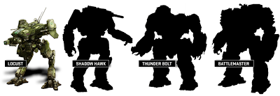
Project Phoenix is a go! The Unseen are back! After all these years, they are back! Back with a vengeance! Welcome to the battlefield; Locust, Shadow Hawk, Thunderbolt and Battlemaster!


